Placeholder for React Native TextInput
Published On: 2024-04-13
Posted By: Harish

For input boxes, we use labels to tell the user about the info to enter. We already saw floating label text input where a floating label is present for the input box.
But what if you don't want to use any label and want just a plain text input? In that scenario, we will use just a text input placeholder to tell the user about the content to enter.
To add a placeholder, just add a placeholder prop to the input with a string value. We can also use placeholderTextColor prop to change the color of the placeholder.
Lets see with an example.
Create A New Project
Create a new react-native project by using npx. Check documentation for creating a new react native project.
npx react-native@latest init TextInputRN
Example Implementation
We will create a simple name text input.
Import the TextInput component in the App.tsx file and add basic required props for the name input.
Add placeholder prop with a string value and also add placeholderTextColor prop for placeholder color.
//App.tsx
import { TextInput } from 'react-native';
...
<TextInput
  style={styles.input}
  keyboardType='default'
  autoCorrect={false}
  autoCapitalize="none"
  placeholder='Enter Name'
  placeholderTextColor='gray'
/>
...
Run the app,
#for Android
npx react-native run-android

#for ios
npx react-native run-ios
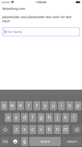
After the render, you will see a text input with a placeholder with gray color.
Please note that the placeholderTextColor prop is different from the font color of the input.
...
<TextInput
  ...
  style={styles.input}
  placeholderTextColor='green'
/>
...
input: {
  ...
  color: 'purple'
}

Complete code of our example,
//App.tsx
import React from "react";
import {
  Text,
  StyleSheet,
  TextInput,
  SafeAreaView,
  StatusBar,
  View
} from "react-native";

export default function App() {
  return (
    <SafeAreaView style={{ flex: 1, backgroundColor: 'white' }}>
      <StatusBar
        barStyle="dark-content"
      />
      <View style={styles.container} >
        <Text style={styles.text}>
          ifelsething.com
        </Text>
        <Text style={styles.text}>
          placeholder and placeholder text color for text input
        </Text>
        <TextInput
          style={styles.input}
          keyboardType='default'
          placeholder='Enter Name'
          placeholderTextColor='gray'
          autoCorrect={false}
          autoCapitalize="none"
        />
      </View>
    </SafeAreaView>
  );
}

const styles = StyleSheet.create({
  container: {
    flex: 1,
    margin: 10,
    gap: 20
  },
  input: {
    borderColor: 'blue',
    borderRadius: 10,
    borderWidth: 1,
    fontSize: 15,
    padding: 10,
    color: 'black'
  },
  text: {
    fontSize: 15,
    color: 'black',
    fontStyle: 'italic'
  },
});
Related Posts
 Hide Cursor of React Native Text Input
 How to Disable Auto Correct in React Native TextInput?
- How to get Keyboard Metrics without Using Events in React Native?
- Get Event Before Keyboard Opening or Closing in React Native
 Select All Text of React Native Text Input on Focus
- What is AllowFontScaling Prop in React Native?
- How to Focus Next React Native TextInput on Enter/Next Key Press?
 Hide Content of React Native TextInput
 Clear Text on Focus in React Native TextInput